Manzar Naskh - منظر نسخ
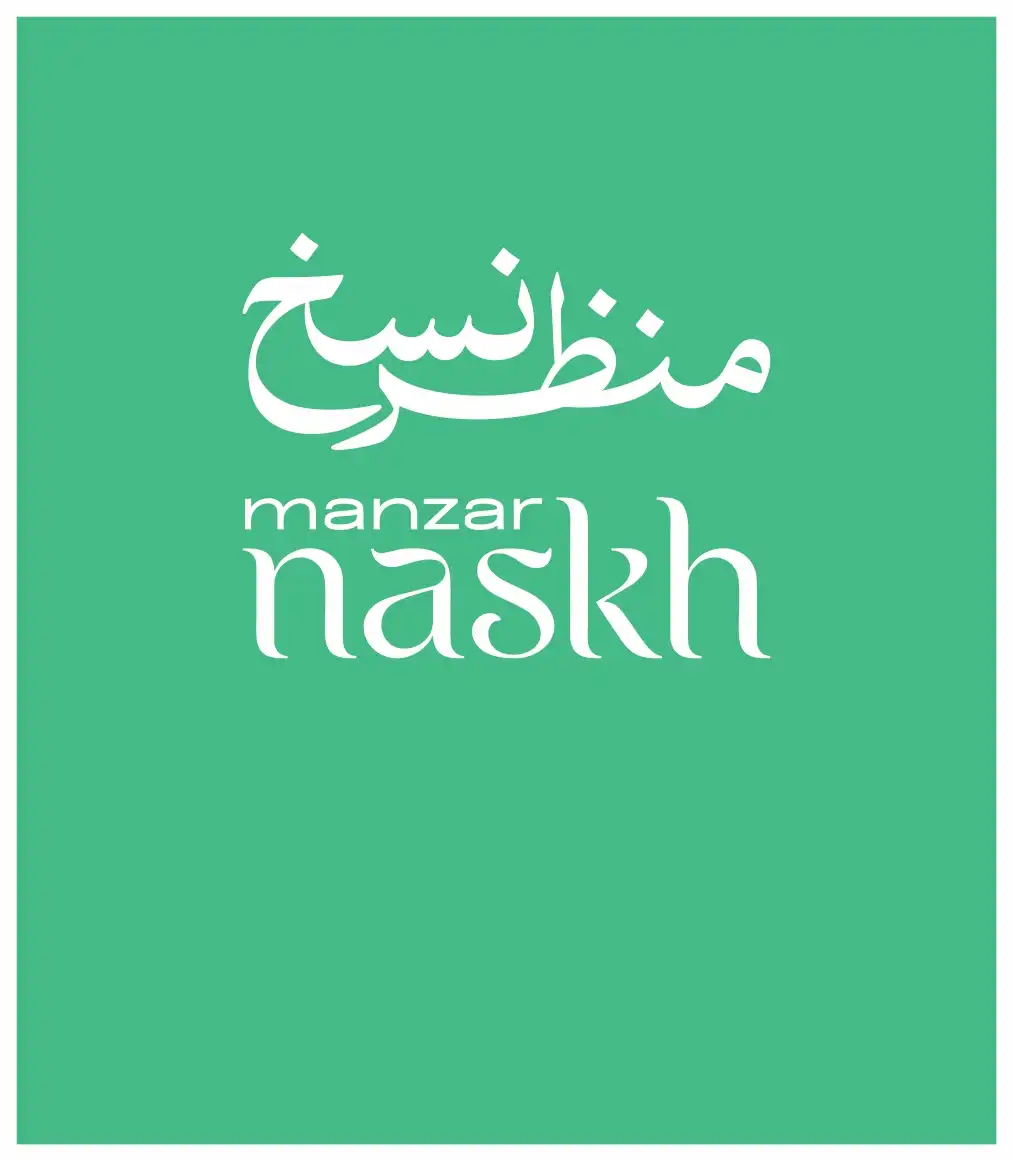
Manzar Naskh - منظر نسخ
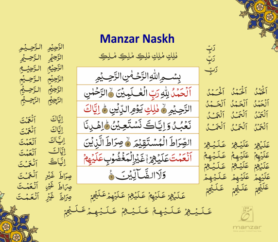
Manzar Naskh: Redefining Quranic Calligraphy
Manzar Naskh is a meticulously crafted Indo-Pak Naskh-style font, specially designed for Quranic publishing. It bridges the gap between traditional calligraphy and digital precision, empowering publishers to create flawless Quranic layouts. In 2010, Manzar Naskh was designed by Arif Anjum, Senior Calligrapher at Axis SoftMedia Inc., and developed by Syed Manzar Zaidi, the founder of Axis SoftMedia and one of the few experts globally in Naskh & Nastaliq font programming. This font is a game-changer for those seeking authenticity and elegance in Quranic text.
Indo-Pak Naskh vs. Uthmani Naskh The primary distinction between Indo-Pak Naskh and Uthmani Naskh lies in their stylistic approaches. Indo-Pak Naskh, traditionally used in South Asia, emphasizes clarity and readability, making it ideal for Quranic recitation. It employs subtle curves and balanced proportions, ensuring each letter stands out distinctly. In contrast, Uthmani Naskh, more common in the Arab world, features elongated forms and intricate ligatures, which, while aesthetically rich, can sometimes compromise readability for non-native readers. Manzar Naskh stays true to the Indo-Pak tradition, enhancing readability while embracing the artistic nuances of classical calligraphy.
Why Manzar Naskh? Manzar Naskh isn’t just another Quranic font; it’s a complete digital calligraphy solution tailored for precision and flexibility:
Multiple Shapes for Each Word
Traditional Quranic fonts offer only one fixed shape per word. Manzar Naskh revolutionizes this by providing multiple shapes, allowing users to expand or condense words as needed. This ensures that each line fits perfectly, mirroring the elegance of handwritten Quranic scripts.
Nuqta and Aerab Control
Each Nuqta (dot) and Aerab (diacritical mark) can be individually moved, rotated, and colored. This granular control was previously impossible in digital Quranic fonts, bringing unprecedented flexibility to typesetting.
Dynamic Kashish (Kasheeda)
Manzar Naskh offers multiple Kashish (Kasheeda) options, enabling users to extend or compress characters with ease. In some cases, a single word can have up to 40 different shapes, allowing the text to seamlessly adapt to the desired layout.
Perfect Layout Control
Whether condensing text to fit within tight spaces or expanding it for visual balance, Manzar Naskh empowers designers to achieve a layout that rivals the beauty of handwritten Quranic manuscripts.
Bold Version Available
Manzar Naskh also comes in a bold version, enhancing readability and visual impact. The bold variant is perfect for creating striking headlines, section titles, and decorative Quranic scripts, giving users even more creative control.
Trusted by Leading Publishers
Today, Manzar Naskh is the font of choice for major Quran publishers across the Indo-Pak region. Its ability to replicate the precision and artistry of traditional calligraphy has made it indispensable in the world of Quranic publishing.
Manzar Naskh stands as a testament to Axis SoftMedia’s commitment to preserving the art of Quranic calligraphy while embracing digital innovation. It brings unparalleled accuracy, control, and beauty to Quranic publishing, ensuring that every page reflects the grace of centuries-old traditions.
Experience the art of Quranic calligraphy in digital form with Manzar Naskh a font crafted for perfection.
Latest Posts
Open Type Font
Manzar Naskh – Precision Redefined for Quranic Publishing
Manzar Naskh, the first Indo-Pak OpenType Naskh font with Kasheeda and multiple shapes, elevates Quranic publishing. With seamless Manzar Typesetting Tool integration, it blends tradition and modern typography beautifully.
- Kasheeda
- Extra Kasheeda
- Manzar Naskh Bold
- Multiple Shapes


